- Adobe Xd
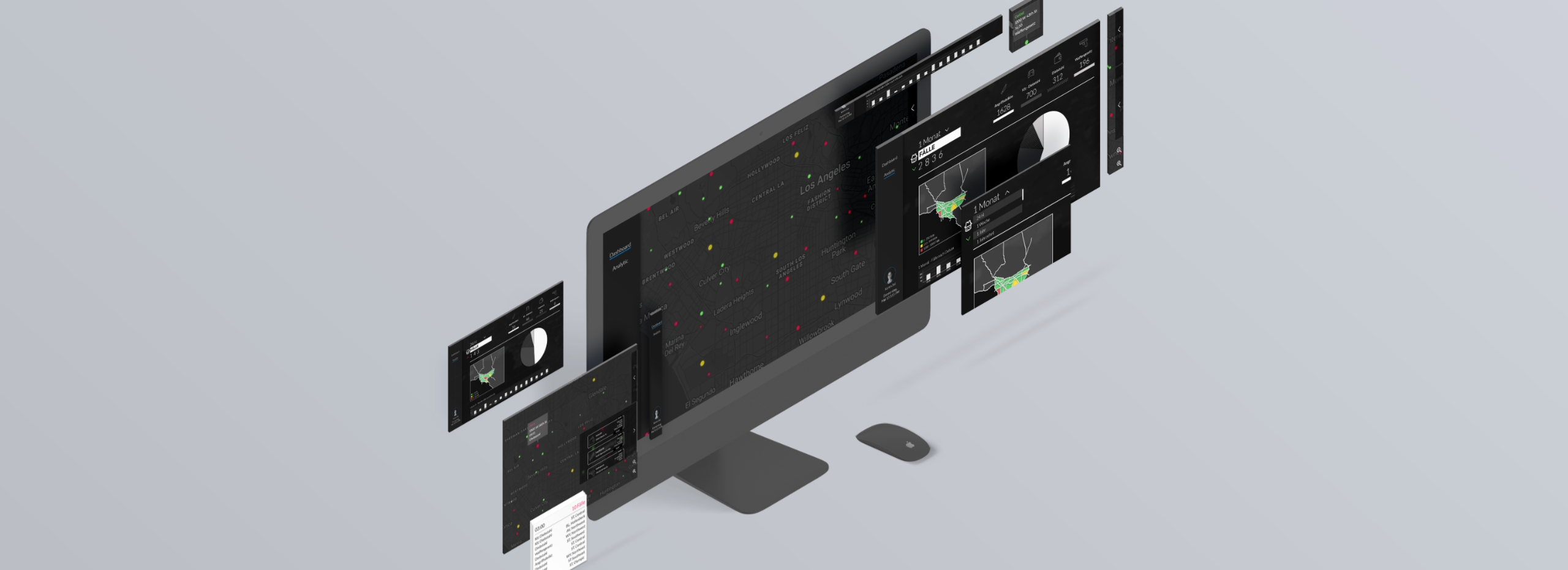
Crime Board
Through an API we received data from the USA where police data is transmitted simultaneously. Here we have developed an application that the police can use on duty. Another point are the past cases on the analytics level where widgets are used.
Problem
The goal is data-graphic visualizations on a topic with daily updated data. These are to be combined in a clear and easy-to-read interactive dashboard.
Solution approach
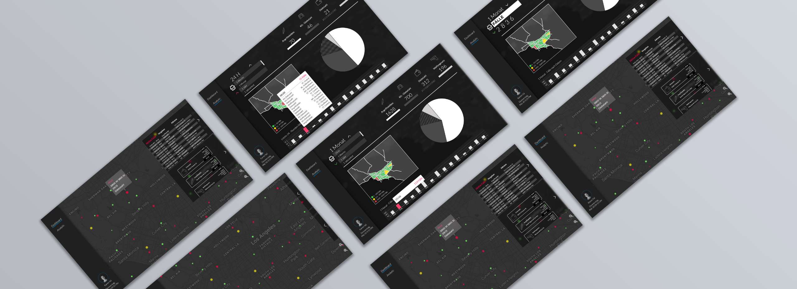
In the application we have divided the layers into two. Here once the dashboard - where you have the interactive map, with different zoom levels, two fold-out glassmorphism tabs. On the upper tab the current cases are displayed as lists & you can also scroll down here. In the lower tab the cases are displayed larger, this tab is more for outdoor use. As soon as you click on a case in the lower tab, you are taken to the point on the map and can also view the case from there or see it on the map. The cases are marked on the map with three different colors: Red = no response team on site yet, Yellow = response team on site & Green = already solved. In the analysis tab the cases of the last 24 h (1 month/ 1 year / decade) are displayed, if this is selected in the dropdown. When the value falls or rises, the color changes. To the right of it, the cases are listed, and below that is a pie chart that belongs to it and illustrates the numbers. To the left of this is another map, which divides the areas and marks them in colors, depending on the number of cases in this area. At the bottom, there is a bar chart that either lists the cases by time or shows the general number of cases.
caption 5
caption 4