- Adobe Xd
Agricult Map
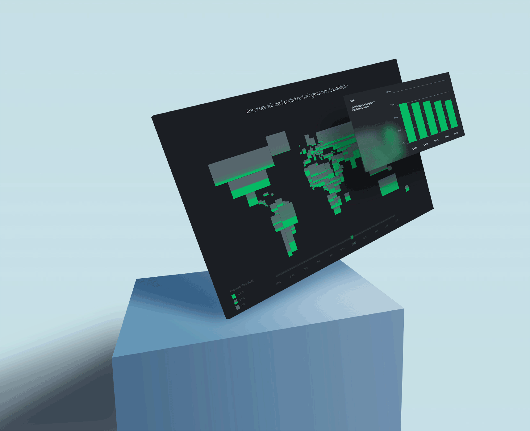
This is about the land area used for agriculture worldwide. The data comes from ourwolrdindata.org.vThe data includes the years, with the corresponding agricultural used land areas.
Problem
The data visualization of the agriculturally used land areas should be presented interactively without pictorial elements (pictograms, photography, ...). Alphanumeric characters (texts & numbers) shall be used as sparingly as possible. Colors, shapes and positions shall make these data visible & encode them.
Prototype - Solution approach
We decided to use the world map in our interface. It occurred to us that the universally known "world map" would not be usable. By abstracting the world map, we could better divide the areas into the percentages. In doing so, some countries were in turn moved to keep the positions of the countries true. At the lower left edge comes the legend, which explains the visualization a little bit. Through the available sources we have also been able to realize several years. These are accessible through the slider below. Another point, which was important to us - we wanted to display several years of a country, but not always move from year to year. By a hover effect on a country - we could add a bar chart. Here again is the name of the country - the percentage on the left and below the years.

caption 1
caption 2